In this tutorial, we will show you how to apply this type of analysis to a dataset that contains data about the sales of a particular retail store. Then, we’ll show you how to provide further value by forecasting the number of new customers that you’ll need in order to achieve certain goals. The process will be:
- Install the runtime environment
- Import and clean the dataset
- Assign cohorts
- Calculate retention rates
- Segment data by Quantity and Revenue
- Forecast the cohort data
Finally, we’ll do some visualizations to make it easier to see our conclusions. Let’s get started.
Before You Start: Install The Cohort Analysis Python Environment
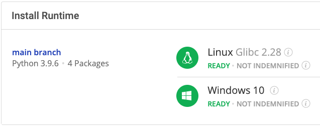
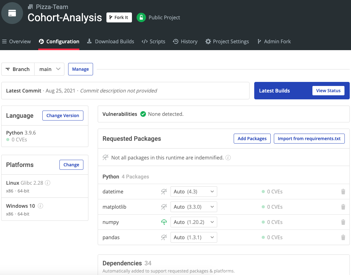
To follow along with the code in this article, you can download and install our pre-built Cohort Analysis environment, which contains a version of Python 3.9 and the packages used in this post, along with already resolved dependencies!
In order to download this ready-to-use Python environment, you will need to create an ActiveState Platform account. Just use your GitHub credentials or your email address to register. Signing up is easy and it unlocks the ActiveState Platform’s many benefits for you!
Or you could also use our State tool to install this runtime environment.
For Windows users, run the following at a CMD prompt to automatically download and install our CLI, the State Tool along with the Cohort Analysis runtime into a virtual environment:
powershell -Command "& $([scriptblock]::Create((New-Object Net.WebClient).DownloadString('https://platform.www.activestate.com/dl/cli/install.ps1'))) -activate-default Pizza-Team/Cohort-Analysis"
For Linux users, run the following to automatically download and install our CLI, the State Tool along with the Cohort Analysis runtime into a virtual environment:
sh <(curl -q https://platform.www.activestate.com/dl/cli/install.sh) --activate-default Pizza-Team/Cohort-Analysis
2–Data Preparation
Let’s take a look at our sample dataset:
df = pd.read_csv('data/scanner_data.csv')
df.head()
As you can see, it contains just a few columns:
- Transaction number (the column labeled “unnamed 0”)
- Date
- Customer ID
- Transaction ID
- Product category
- SKU identifier
- Quantity
- Sales amount (which is the unit price times the quantity)
But we’ll need to clean up the data and format the dates before we can make use of it. We’ll also want to put transactions performed by the same customer on the same date in a single row since our demonstration will be based on transaction date, quantity, and sales amount, rather than product type. Here’s how:
df.drop(['Unnamed: 0'], axis = 1)
df.Date = pd.to_datetime(df.Date, format='%d/%m/%Y')
df.duplicated(["Date","Customer_ID"]).sum()
Output:
68979
df = pd.DataFrame(df.groupby(["Date","Customer_ID"]).agg({'Transaction_ID':max
                                                          , 'SKU_Category':max, 'SKU':max, 'Quantity': sum
                                                          , 'Sales_Amount':sum})).reset_index()
df.head()
After applying these modifications, the size of the dataset has been cut in half.
The next step is to merge similar rows (for example, the same customer_id on the same date) using Panda’s groupby and agg functions, which will:
- Replace the quantity and sales_amount of the resulting row with the sum of all of the merged rows
- Use the max value for the transaction_ID, SKU_category, and SKU columns.
3–Assign Cohorts to Data
To run a cohort analysis, we’ll need to:
- Split the data into groups that can be analyzed on the basis of time
- Assign a cohort index for each transaction
- Create two new columns
The following code shows how to apply a simple lambda function to the date column in order to:
- Create the tx_month column
- Transform tx_month to get the minimum value of tx_month per customer
- Assign tx_month per customer to the acq_month column:
df['tx_month'] = df['Date'].apply(lambda x: dt.date(x.year, x.month,1))
df['acq_month'] = df.groupby('Customer_ID')['tx_month'].transform('min')
df.loc[df['tx_month'] != df['acq_month']].head()
As you can see, customer number 50 was acquired on January 1, 2016, but transaction number 5004 wasn’t performed until February 1, 2016. The cohort index for the row is the time difference between tx_month and acq_month, and the difference between the dates is calculated by a function that adds 1 to the result in order to start the cohorts at 1 rather than 0 (ie., a transaction made in the same month as the acquisition):
def diff_month(x):
    d1 = x['tx_month']
    d2 = x["acq_month"]
    return ((d1.year - d2.year) * 12 + d1.month - d2.month)+1
df['cohort_idx'] = df.apply(lambda x: diff_month(x), axis=1)
df.head()
4–Calculate Retention Rates
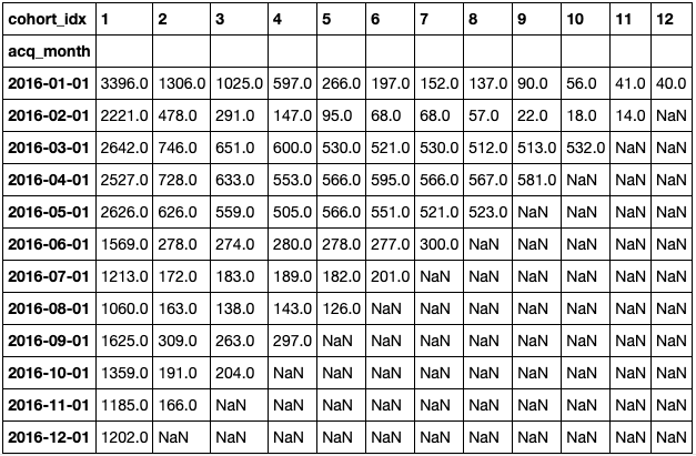
We can now make some interesting calculations, such as finding out how many unique customers were acquired per month per cohort by setting the cohort_idx per row. The function below takes a dataframe, a variable to be grouped, and a function to be used as aggregate data, and returns two matrices:
- The first shows the absolute value per cohort per month, with the function applied over the variable and passed as an argument,
- The other represents the results as a percentage:
def get_cohort_matrix(data, var='Customer_ID', fun=pd.Series.nunique):
    cd = data.groupby(['acq_month', 'cohort_idx'])[var].apply(fun).reset_index()
    cc = cd.pivot_table(index = 'acq_month',
                        columns = 'cohort_idx',
                        values = var)
    cs = cc.iloc[:,0]
    retention = cc.divide(cs, axis = 0)
    retention = retention.round(3) * 100
    return cc, retention
Then run:
cc, retention = get_cohort_matrix(df)
cc
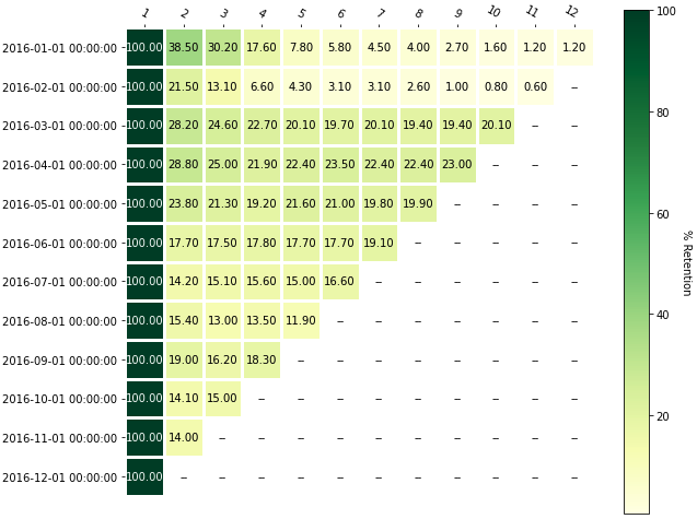
With the help of the annotated heatmap functions provided by matplotlib, we can see a graphical representation of the number of unique customers per cohort over time:
With this information, you can perform a time-based cohort analysis, commonly known as a retention analysis. In the above image, you can see that:
- 38.5% of customers acquired in January of 2016 returned the following month
- 21.5% of customers acquired in February of 2016 returned
Customers acquired since the cohort of 2016-05-01 are even less likely to return, which is something that should grab your attention.
5–Segment Data by Quantity and Revenue
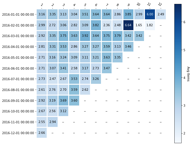
You can also use the previous function (get_cohort_matrix) to create cohorts based on the average number of items. In the example below, the variable is quantity and the aggregate function is the mean:
cc_q, ret_q = get_cohort_matrix( df, var=’Quantity’, fun=pd.Series.mean )
cc_q
Plotting the absolute number is easy, and it shows that there are two periods of unusual behavior. With further analysis, you should be able to determine some possible explanations and hypothesize about ways to replicate good results.
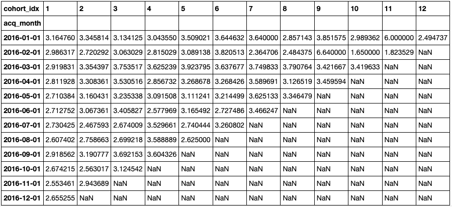
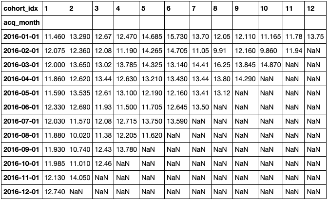
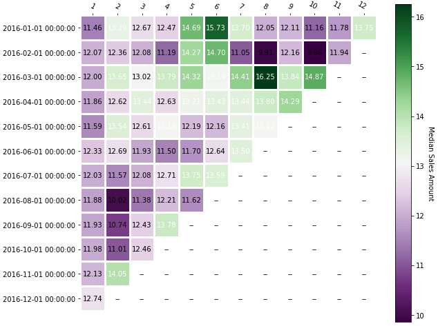
You can also use the sales_amount variable to determine if customers in certain cohorts spend more money than others. In the following example, the sales_amount is the variable and the aggregate function is the median:
cc_sa, ret_sa = get_cohort_matrix( df, var='Sales_Amount', fun=pd.Series.median )
cc_sa
The following heatmap shows that the cohort acquired in March of 2016 was the best in terms of revenue over time. In addition, you can see that the most recent acquisitions bring in less money, which is also something to pay attention to:
6–How to Forecast Cohort Data
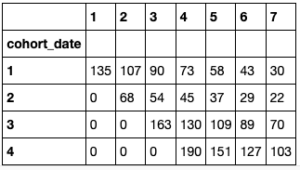
Businesses can also gain value from a cohort analysis by using it to forecast. The Theseus library contains many interesting methods for analyzing cohorts on a daily basis using daily retention rates calculated from historical data and daily acquisition numbers. For example, you can use the number of users for the first five days to feed the model:
ret_avg = [80, 70, 50, 45, 30, 25, 21,]
ret_days = [1, 2, 3, 4, 5, 6, 30]
new_users_daily = [ int(x) for x in list(df.loc[df['Date'] <= dt.datetime(2016,1,5)].groupby('Date')['Customer_ID'].apply(pd.Series.nunique).values)]
new_users_daily
Output:
[135, 68, 163, 190]
Then run:
th = thg.theseus()
cohorts = new_users_daily
th_profile = th.create_profile( days = ret_days, retention_values = ret_avg )
profile_DAU = th.project_cohorted_DAU( profile = th_profile, periods = len(ret_days),
    cohorts = new_users_daily, start_date = 1 )
profile_DAU.head()
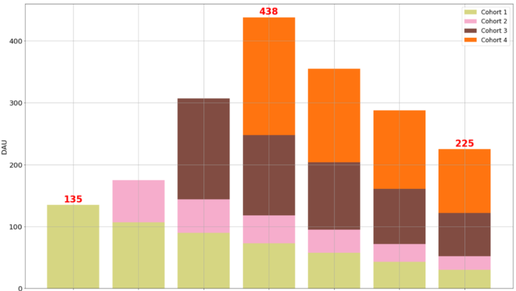
The previous image shows how to build a company profile by feeding the retention percentage for the first week and a sample number of daily users into the model. This profile can be used to obtain a stacked chart of Daily Active Users (DAU) with only a single line of code that’s based on the curve fitted by the model:
th.plot_forward_DAU_stacked( forward_DAU = profile_DAU,
    forward_DAU_labels = [ 'Cohort ' + str( x ) for x in list( profile_DAU.index ) ],
    forward_DAU_dates = list( profile_DAU.columns ), show_totals_values=True
)
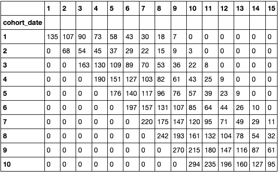
But the most interesting part is that you can set a goal for having a certain number of DAU in a specific time period, and the model will return the number of acquisitions that you need per day to achieve that goal:
expected_DAU = th.project_cohorted_DAU( profile = th_profile, periods = 15, cohorts = new_users_daily,
    DAU_target = 1000, DAU_target_timeline = 10, start_date = 1 )
expected_DAU.head(10)
As you can see, the company must keep increasing acquisitions in order to get 1,000 DAU in ten days with the given retention rates and the initial four values [135, 68, 163, 190]. Of course, this analysis is not the only way to build acquisition and retention strategies, but the ability to easily play with different scenarios certainly helps.
Conclusions: Cohort Analysis Works With Limited Data
Cohort analysis is one of the most common techniques used to get value from “small” data (as opposed to big data) without complicated models. This isn’t the only option, of course, and companies can also perform similar kinds of analyses to build a data-informed culture without having to invest heavily in other resources. Since cohort analysis can display results in a graphical way, though, it helps users to visualize and understand trends easily.
- All of the code used in the article can be found on GitHub.
- Download our Cohort Analysis Python environment, and try performing cohort analysis on your data.
With the ActiveState Platform, you can create your Python environment in minutes, just like the one we built for this project. Try it out for yourself or learn more about how it helps Python developers be more productive.
Related Reads
Movie Box Office Data Analysis with Python – Budgets vs Popularity?


