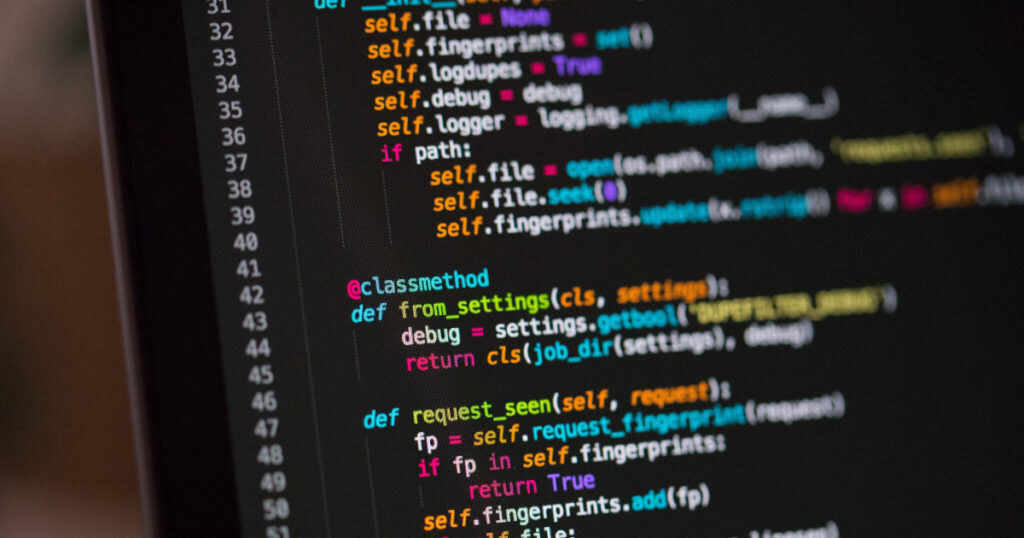
Each day us programmers spend hours upon hours looking at our screen, and the main thing we look at is not our IDE, it’s not our software or our browser; it’s our code. So it’s only natural that our code should be a pleasure to look at. One side of this is completely in your own hands; writing clean and sensible code. The other side slightly less so; the font you choose to represent your code.
There are tons of articles on what is (subjectively) the “best” coding font out there, but they all seem to focus on the usefulness of the font, i.e. how the font facilitates you to write code more efficiently. Whilst this is definitely an important point I feel that what is equally important is the attractiveness of the font, what’s the point of it being efficient if it’s not making you feel good about your code? Your font is supposed to make you “want” to code, it’s supposed to make your code look THAT much better. This is what I want to focus on in this blog; what fonts I’ve tried and enjoyed the most, not (just) because of how efficient they are, but because of how they made me feel like coding with
them.
Cross-Platform Problems
One of the main issues I’ve ran into in trying different fonts is that they tend to “look” very different on each platform; this is because each platform renders text slightly differently, OSX in particular tends to give fonts a bit of a bold look which I personally quite enjoy, but rarely can I use the same font on OSX and eg. Linux as they simply do not “feel” the same. The fonts I address here I used primarily under OSX and Linux so my take on them might be less relevant if you are using Windows, you’d have to see for yourself.
Tweaks
I’ve made a few slight tweaks in Komodo that help me enjoy writing code more. First I increased the line height slightly to let my code “breathe” a little more, you can use the follow code snippet as a Macro (trigger it on startup) to increase your line height (modify the amount to suit your preference).
var editor = komodo.editor;
editor.styleSetSize(editor.STYLE_BRACEBAD, 13);
We will most likely be increasing the line height by default in Komodo 9. Another tweak you might want to look into if you’re an OSX user is the “Font Quality” setting under `Preferences > Fonts and Colors > Fonts`, this allows you to switch between different rendering presets offered by OSX. Similarly if you’re a linux user it’s worth playing with your font rendering settings, unfortunately there is no “one” guide that works for every distro, you’ll have to search for this yourself.
The “Best” Coding Fonts
Again this is entirely subjective and not an exhaustive list of what is available out there. I am not trying to give a technical overview of what the font does, there are plenty of resources out there for that already. I am simply explaining how the font makes me “feel” about my code and how that translates into my being more efficient.
All of the screenshots below were taken in Komodo IDE using the Spacemodo color scheme
DejaVu Sans Mono

My current favourite font is DejaVu Sans Mono (on Linux), I was previously using Source Code Pro (on OSX – featured below) but when switching between Linux I found that it just didn’t render consistently, after playing around with different fonts I found that using DejaVu Sans Mono set to “bold” mostly gave me the same feel as Source Code Pro did on OSX.
Which is to say it made my editor feel a little bit more “playful”, but not “too” playful (Comic Sans anyone). I feel something a lot of the programming fonts seem to focus so much on efficiency that they end up looking very square and dull, which is a shame.
DejaVu Sans Mono is part of the DejaVu Fonts project which is based on the Vera Fonts. ”Its purpose is to provide a wider range of characters while maintaining the original look and feel through the process of collaborative development”.
Website: http://dejavu-fonts.org/wiki/Main_Page
Download: http://dejavu-fonts.org/wiki/Download
Source Code Pro

As I already mentioned Source Code Pro is my OSX counterpart of DejaVu Sans Mono, it renders beautifully using the “Anti-Aliased with Smoothing” `Font Quality` setting. Both fonts work on all platforms, it’s just that Source Code Pro in my opinion works better on OSX and DejaVu Sans Mono works better on Linux. Again the main thing I love about these fonts is that they come across as slightly playful, which you’ll see is a recurring theme for my most liked fonts.
Unlike DejaVu Sans Mono and some of the other fonts mentioned here Source Code Pro was created specifically with programmers in mind.
Website: https://github.com/adobe-fonts/source-code-pro
Download: https://github.com/adobe-fonts/source-code-pro/releases
Monaco

Monaco is a great font which I used for quite a while, it was the default Monospace font for OSX until it was replaced by Menlo in 2009. Ultimately I was turned away from using it because it’s a little bit “too” playful to me.
Monaco comes shipped with OSX and as far as I’m aware there are no other legal means to obtain it, so non-OSX users are out of luck.
Droid Sans Mono

Droid Sans Mono is an great font which to me manages to walk fine line between playful and “professional”. It feels a bit like Monaco (OSX) and Courier (Windows) had a baby. Particularly on OSX it looks beautiful. It looks decent on Linux too though I prefer to use it as “Bold” as it looks too much like Courier and too little like Monaco otherwise.
Droid Sans Mono is part of the Droid Fonts and was developed specifically for Android, but has since found its way into many the editors of many programmers. Although the font is free and open source there is also a Pro version available; ”The “Pro” versions will be in the OpenType format with additional typographic features. The initial release has Old Style Figures, and more enhancements are planned for the future.”
Website: http://www.droidfonts.com/
Download: https://www.google.com/fonts#UsePlace:use/Collection:Droid+Sans+Mono
Ubuntu Sans Mono

Ubuntu Sans Mono is a bit different, it tends to feel more condensed and has the distinct slanted design the Ubuntu fonts are “known” for. I find it a pleasing design but it feels more appropriate for logo’s than for large blocks of text or code, it feels like it’s trying to prove something rather than just “be a font”. I had to significantly increase the font size and line spacing for the font to render properly for me, after that it was quite enjoyable but in the end just doesn’t come close to my beloved DejaVu Sans.
I also wasn’t able to make it render in a way that I liked on OSX because of the font smoothing OSX does, obviously this font was designed specifically for Ubuntu so it’s understandable that it was not optimized for other platforms.
Website: http://font.ubuntu.com/
Download: http://font.ubuntu.com/
M+

Finally there’s M+, I bumped into this font the very same day I wrote this blog thanks to this blog post written by Tom MacWright. The font seems to have been created specifically for programmers as it has several variations that each slightly alter the way the font looks.
It’s an absolutely great font but not entirely up to my tastes; I like how condensed it is but it’s a little bit TOO condensed for my tastes. As I mentioned earlier in this blog post I like my code to be able to “breathe” a little, and while it’s great to be able to see a lot of your code on-screen it also makes it a little bit chaotic. To be fair though, M+ is so clean and stylish it tends to make even the most chaotic code look beautiful.
Website: http://mplus-fonts.sourceforge.jp
Download: http://sourceforge.jp/projects/mplus-fonts/releases/#6650
Final Words
So those are my favourite fonts and how I use them in Komodo. Expect to see some new font features in Komodo 9 (I already mentioned line-height). Please feel free to share your favourite fonts in the comments below!
Title photo courtesy of Chris Reid on Unsplash.


