Data analysis is a primary use case for Python, but data analysis without data visualization is, well, boring. In this tutorial, we’ll show you how to build captivating data visualizations using the Python programming language. This step-by-step guide is designed to walk everyone from beginners to data scientists through the process of using Python to find ways to tell stories with their datasets.
If you’re in the process of learning how to wrangle datasets, you can find quite a few other data analysis resources here:
- Will AI Save Us? Use this Pandas Data Analysis Tutorial to find out.
- Movie Box Office Data Analysis with Python – Budgets vs Popularity?
- Exploratory Data Analysis using Python
- Human Impact on Amazon Rainforests: A Geospatial Analysis Using Python
- Cohort Analysis with Python’s matplotlib, pandas, numpy and datetime
For the purposes of this tutorial, we will be using the “Cost of Living Index by City 2022” dataset from Kaggle to build visualizations by working through the following steps:
- Create a Jupyter Notebook
- Gather and load the data
- Understand the data
- Clean and organize the data
- Visualize the data
Let’s go.
Before You Start: Install The Data Visualization Python Environment
To follow along with the code in this article, you can download and install our pre-built Data Visualization environment, which contains:
- A version of Python 3.10.
- All the dependencies used in this post in a prebuilt environment for Windows, Mac and Linux.
- All the code in this post will also be installed automatically from GitHub when you install the environment.
In order to download this ready-to-use Python project, you will need to create a free ActiveState Platform account. Just use your GitHub credentials or your email address to register. Signing up is easy and it unlocks the ActiveState Platform’s many other dependency management benefits.
Or you can also use our State tool CLI to install the Data Visualization runtime environment and project code:
For Windows users, run the following at a CMD prompt to automatically download and install the Data Visualization runtime and project code into a virtual environment:
powershell -Command "& $([scriptblock]::Create((New-Object Net.WebClient).DownloadString('https://platform.www.activestate.com/dl/cli/_pdli01/install.ps1'))) -c'state activate --default Pizza-Team/DataVisualization'"
For Linux users, run the following to automatically download and install the Data Visualization runtime and project code into a virtual environment:
sh <(curl -q https://platform.www.activestate.com/dl/cli/_pdli01/install.sh) -c'state activate --default Pizza-Team/DataVisualization'
Step 1 — Create and Run a Jupyter Notebook
We’ll be using Jupyter Notebooks for this tutorial. If you’ve installed the Data Visualization runtime environment, you can now:
- Create a folder on your system called “Data Visualization” or something similar
- Open up your terminal application and navigate to the folder location and run the following command:
jupyter notebook - The Jupyter Notebook server should start in your browser:
- To create a Jupyter Notebook all you need to do is click on the New button dropdown on the right and choose Python 3.
Now that we have Jupyter set up, we can get started on our project.
Step 2 — Gather and Showcase the Dataset
The first thing you need to do is download the Cost of Living Index by City 2022 dataset locally and save it as a csv file on your system.
We’ll be using Pandas to work with the dataset. Pandas is an open source Python package primarily used for data science and machine learning tasks. You can read more about Pandas in Python and its many uses here.
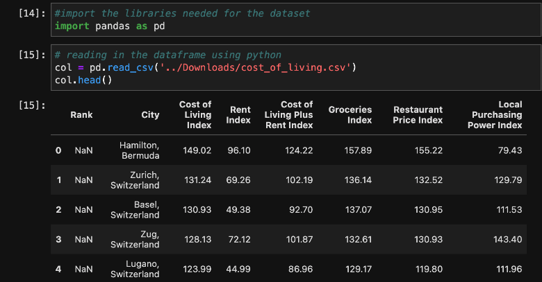
Let’s get started in our Jupyter Notebook by creating a few code cells and loading the dataset into a Pandas dataframe. We can then use the head command to see the top 5 items in the csv file:
Now that we have the dataset loaded into a dataframe in our Jupyter Notebook environment, we can take a closer look at the data and start to tell a story with visualizations.
Step 3 — Understand the Data
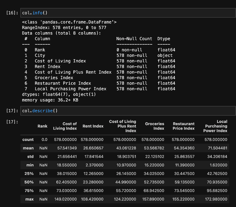
Since the data represents the Cost Of Living (COL) in various cities, we will name the dataframe “COL.” When we call the info command, we’ll be able to see all of the available columns in the dataset along with their corresponding data types. We can also see how many non-null values are in each of the corresponding columns.
As you can see in the image below, we have one object type: the city column. The other seven data types are float64.
We can observe statistics around the dataset by applying the describe method against the dataframe. Since our data is primarily numerical, the index results include the count, mean, std, minimum 25%, 50%, 75%, and maximum from the dataset.
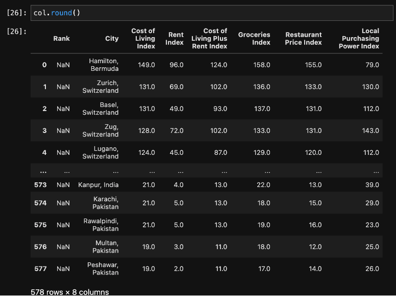
Notice that this shows six digits after the decimal point. To make the data a bit easier to read, we’ll remove the digits after the decimal and round to the closest whole number.
Step 4 — Clean and Organize the Data
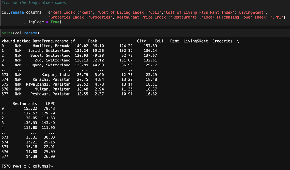
As you can see, the names of the columns are very long. So, let’s rename them. We can use the Pandas rename() method to rename any index, column, or row:
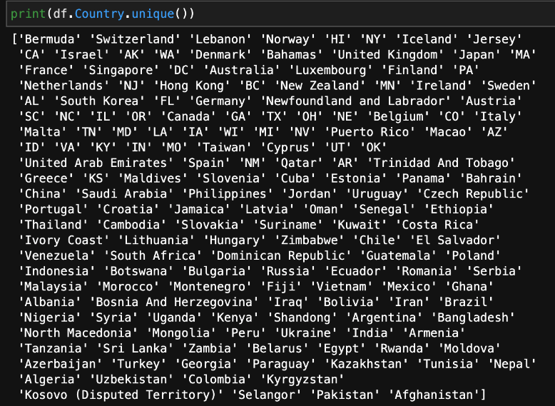
Now that we’ve successfully renamed the columns, let’s take a look at the countries.
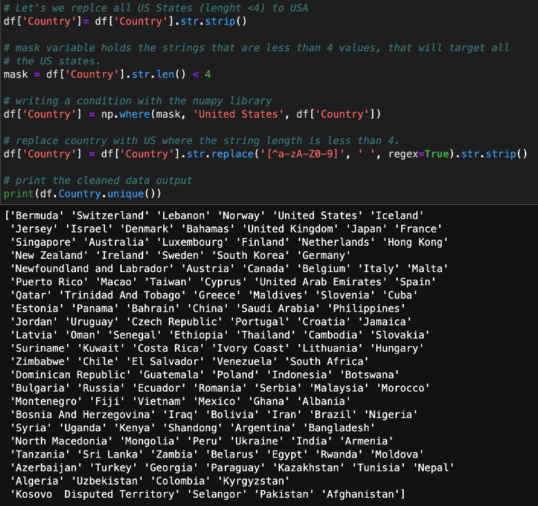
At this point, the data is not organized in a way that makes sense. For example, OH, UT, and AZ are not countries; they are states within the United States. We need to replace all of the states with the name of the country to which they belong. We can do that with the following code:
Now that we’ve cleaned the data up a bit, let’s start visualizing it.
Step 5 – Data Visualization
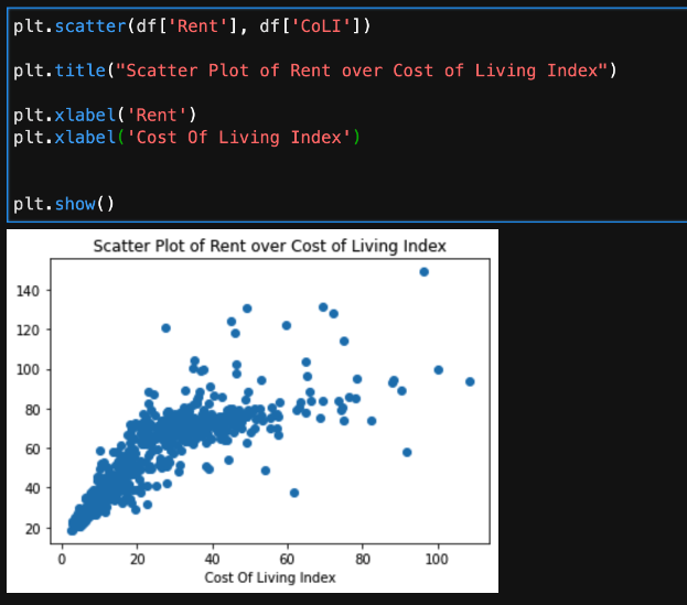
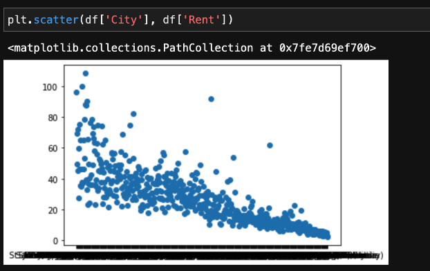
One of the simplest ways to get started visualizing data is to use the Matplotlib package’s submodule pyplot (plt) to create a quick graph of your data. For example, you can use the following code to see rent over cost of living displayed in a scatter plot graph:
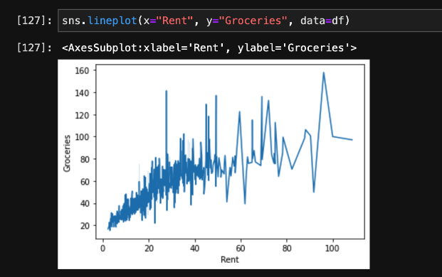
Next, let’s use another package called Seaborn (sns) to visualize what rent and groceries look like. Do you see a correlation here? Overall, as the price of rent increases, we see that the cost of groceries increases as well.
Wouldn’t it be useful to see this broken down by city? The original scatter plot diagram we created did not include the cities, but we can easily update it:
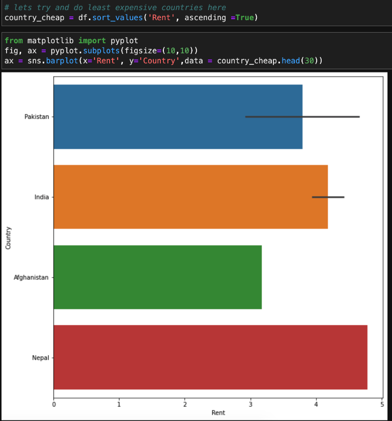
We can also use the matplotlib package itself to visualize data. We’ll create an index called “country_cheap” so that we can view the countries with the cheapest rent:
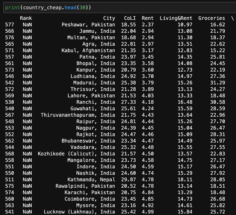
Now, we can create a table that lists the cities with the cheapest rent, along with the names of the countries in which they are located.
Conclusions – Python for Data Visualization
Data visualization with Python is a key skill not only for aspiring data scientists, but for anyone that works with data. Plotting data visually exposes the patterns, trends, and correlations among the entities, which would otherwise be lost in tables and lists.
This guide has shown you how to load a dataset using Python, how to organize and view your data using Pandas, and several ways to familiarize yourself with data visualization in Python. We’ve covered the basics, but there’s so much more to learn and discover! There are plenty more packages that you can use to visualize data with Python, as well as a variety of datasets on Kaggle that you can examine. Just remember to have fun and keep exploring your data!


