But for those of us that use Python, Jupyter can serve many of the same purposes, allowing teams to organize datasets, plot data graphs, and perform data manipulation, as well as share text and code. In contrast to Excel, however, Jupyter notebooks are far more interactive and create far nicer visualizations than comparatively static, boring spreadsheets.
Of course, while everyone has at least a basic understanding of how to work with Excel, Jupyter skills are harder to come by in most industries. But what if you could combine the ease-of-use of Excel with the interactivity of Jupyter? Well, luckily there’s a plugin that allows this to happen!
PyXLL-Jupyter lets you integrate Jupyter notebooks with Microsoft Excel for Windows (currently does not work with Excel for MacOS or the Office 365 version of Excel). When this package is installed you’ll be able to plot your data in Jupyter and have the ability to share the plots with Excel seamlessly.
Read on if you want to provide your constituents with highly interactive spreadsheets that combine:
- Ease of use of Excel
- Programming in Python
- Exciting data visualizations with Jupyter Notebooks
This post will show you how to run Jupyter inside Excel step by step. You’ll get to learn how to:
- Install the Python packages you’ll need
- Install the plugin for Excel
- Launch Jupyter in Excel and create a dataframe
- Plot data in Excel with Jupyter
Ready to integrate Jupyter with Excel? Let’s get started!
1–Installing PyXLL Python Packages
To get started, you will need to run the following command to install the PyXLL Python package, which is a prerequisite for pyxll-jupyter:
pip install pyxll
We can now install the pyxll-jupyter package:
pip install pyxll-jupyter
2–Installing the Excel Plugin for PyXLL
For Excel to work with pyxll, we’ll need to install the PyXLL plugin for Excel, which you can download here: https://www.pyxll.com/download.html. After you download the file, unzip it and open the pyxll.cfg file in your favourite text editor.
You can edit this settings in this file to, for example, work with more verbose logs by simply changing the LOG entry for verbosity like so:
[LOG]
verbosity = debug
You’ll also need to change the PYTHON executable entry in order to provide the actual location of your Python interpreter. The executable path should look like the following entry:
[PYTHON]
executable = <path to your pythonw.exe>
You can determine the path for your installed Python interpreter with the command:
python -c "import sys; print(sys.executable)"
Replace <path to your pythonw.exe> with the output of this command and save your file.
Now you can install the plug-in for your version of Excel for Windows. The installation method is different depending on your version:
- Excel 2010 – 2019
Select the File menu in Excel and go to Options -> Add-Ins -> Manage Excel Addins and browse for the folder you unzipped PyXLL to and select pyxll.xll. - Excel 2007
Click the large circle at the top left of Excel and go to Options -> Add-Ins -> Manage Excel Addins and browse for the folder you unzipped PyXLL to and select pyxll.xll. - Excel 97 – 2003
Go to Tools -> Add-Ins -> Browse and locate pyxll.xll in the folder you unpacked the zip file to.
3–Launching Jupyter in Excel
Once everything is installed you’ll end up with an example workbook with samples that demonstrate how to best use PyXLL. PyXLL has support for the following popular Python plotting packages, as well as a few others:
(For more information on plotting data, see our previous Plotly vs Matplotlib blog post. For tutorials around Plotly and Matplotlib you can also refer to our Plotly and Matplotlib quick reads)
The charts generated using these packages are typically preferred over Excel’s custom charts since they not only allow for customization but also give you far more control over the final look and presentation of your data. The following video from the creator of PyXLL provides a good overview of how to use your Jupyter Notebook inside of Excel, and even extract your Excel data and showcase it in a data frame within a Jupyter notebook in Excel!
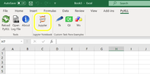
You can now launch Excel. Note that the “Jupyter” button will appear in the Pyxll tab, as shown below:
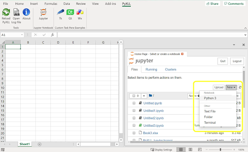
When you click on the Jupyter button, you’ll see a Jupyter panel appear where you can begin interacting with Excel and Jupyter.
Click the “New” dropdown and select Python 3 to create a new notebook to interact with:
If you already have data in Excel, you can pull that data directly into your Jupyter notebook using the following command %xl_get:
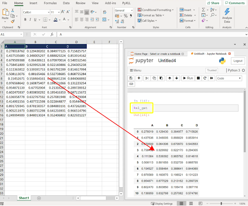
4–Plotting Data in Excel with Jupyter
When working with datasets, it’s important to keep in mind how you want to present the data. Data visualization can help everyone gain insight quickly from the rows and columns. Pyxll has integrations with all of the main plotting libraries in Python, so you can take full advantage when running your Jupyter notebook in Excel.
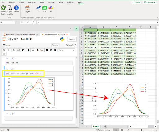
Plotting with pyxll is very simple. All you need to do is convert your Excel data into a dataframe by running the following command in Jupyter:
%xl_set df
Now you can plot the data using a command like the following one:
%xl_plot df.plot(kind=”kde”)
Note that the kind parameter defines which kind of plot you’d like to use. For example, you could change the above plot to a scatter plot instead by using kind=’scatter’.
Conclusions
Excel is great for manipulating data, and okay for visualizing it. But embedding a Jupyter Notebook inside Excel can take your team to the next level of data manipulation and visualization. If your users are willing to learn a few Python skills, the results can make a huge difference in how consultants, analysts and financial planners interact with their customers.
But even if you’re already a Pythonista, you can have a lot of fun with Excel if you already know your way around a Jupyter notebook. After all, everyone in your organization is already familiar with Excel, but only data analysts and data scientists are likely to be familiar with Jupyter. As a result, it can be much easier to share an Excel workbook with all the stakeholders in your data science project so they can see the results for themselves using the amazing visualizations available to you via Jupyter.
No matter where you’re coming from – consulting, analytics, BI – pyxll offers a great alternative to boring old Excel. Everyone should give it a try!
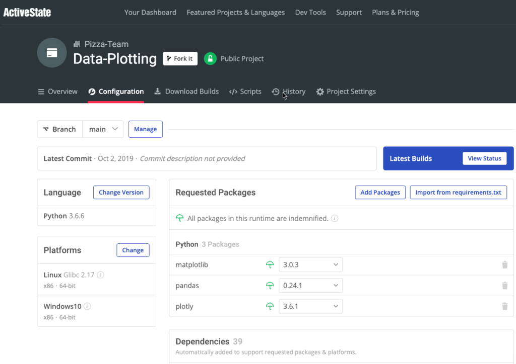
If you want to explore more of what you can do with plots in Jupyter, try our pre-built Data Plotting Environment for Windows and Linux.
It bundles up Python 3.6.6, matplotlib and plotly so you can just install it and start building plots right away.
Related Reads


