The Komodo dev team has been busy adding tons of functionality to our Komodo IDE and Edit products over the past several months. Most recently we released Komodo 9.2, which includes:
Docker & Vagrant Integration (IDE only)

Komodo’s Commando now allows you to work with Docker and Vagrant directly within Komodo, thus decreasing disruptions and wasted time. You can easily see your instance names and commands directly from the Commando panel, negating the need to be intimately knowledgeable with Docker and Vagrant.
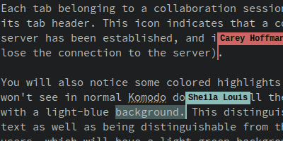
Collaboration Improvements (IDE only)

Collaboration has been given a significant face-lift and is now a joy to work with! Most notable are the new caret flags, indicating what your colleagues are editing. Code better with your teams with our updated collab tool.
Real-Time Spell Checking (IDE only)

Automatically check for spelling errors in real-time, in-line while writing code. Spelling errors can be easily found and corrected within the editor. This uses Mozilla language packs, so you can add support for your preferred language by installing the relevant language pack in Komodo.
Komodo Package Installer

A new package installer allows packages such as add-ons, color schemes, skins, keybindings, and languages, to be installed directly from inside Komodo, providing easier access to new functionality and allowing developers to quickly turn to community contributions for specialized functionality to meet project requirements.
EditorConfig Integration

We now offer EditorConfig integration, allowing developers to define and maintain consistent coding styles between different projects, editors and IDEs. No more worrying about details like consistent indentation across your project when working with multiple developers.
Focus (Distraction Free) Mode

Now with a single keystroke, you can hide non-essential UI elements to pare down the Komodo UI and focus solely on your code. This is ideal if you like a clean, minimalistic editor but sometimes just NEED to access some of the more advanced and crucial UI elements.
Crisper UI
The UI is now even more clear (particularly when using dark color schemes). Minor as it may seem, those small bevels and fuzzy borders were taking away from an otherwise perfect experience.
Want to see some of the new features in action? Check out the video below.
Want to try these features out for yourself? Download the free 21-day trial and give the new features a whirl!


