If you installed Komodo X recently and you were not one of the users who participated in the Beta release phase then when you opened Komodo you might have thought you downloaded the wrong program ([Chess any one?](https://komodochess.com/)). But you didn’t. Komodo’s User Interface (UI) and User Experience (UX) received a huge amount of attention.
Someone tweeted at us after the Komodo X release (it’s gone now 🙁 …they deleted the tweet) that *”Change for the sake of change is no good.”* This is a great great GREAT point and something all of us on the Komodo dev team believe strongly in.
The goals behind the changes were 5 fold:
- Do NOT alienate existing users
- Simpler (less cluttered) and more intuitive UI
- Uber customizable
- Universal experience across all platforms
- Easier to maintain (For us and our open source community)
Change for the sake of change is not good, but change for the sake of progress/evolution is.
Don’t Alienate, Assimilate
The above is likely the WORST section title I’ve ever come up with, but it’s kind of what we tried to do. Many aspects of the Komodo UI had become clunky with workflows that were not intuitive. We NEEDED to fix this. But we had to make sure new and existing users were happy. This isn’t easy and ultimately almost impossible. So, along with the UI updates to fix work flows and make things more clear, we added the ability to rollback most of these changes so users could see a UI that looks more like the Classic Komodo and can be enabled with the click of a checkbox (*Preferences > Appearance > Enable Classic Mode*). Most users who have tweeted at us or posted in our forums with an initial negative reaction have come around quickly (there, I did it, full circle, assimilation complete).
Simpler and Intuitive
By removing clutter (No more “Buttons for everything! YOU get a button and YOU get a button and YOU…”) and creating dynamic tools we’ve been able to simplify the Komodo user interface. Tools appear and update based on the context of your project (eg. Gulp integration, Version control). Only buttons that are used on a regular basis remain static in the interface. Those buttons are more logically grouped.
These are just some of the changes we’ve made to the initial interface. There is also a first start wizard that allows you to configure the most common preferences before you start working in Komodo.
Customizable
The Komodo interface is now completely (literally) customizable. Actually, that statement isn’t quite right. Komodo has ALWAYS been completely customizable. Using a custom CSS file, Userscripts and custom addons, Komodo has always supported its users to customize the software to suit their needs. But now we’ve made it even easier. Using the color scheme editor you can now point and click to edit colors in the UI. You can also add your own CSS to customize the look and layout of the interface in the editor dialog under the *Interface* section in the leftmost dropdown list.
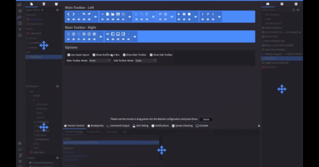
It’s worth taking a look at the new Toolbar Customization tool as well. Right click the toolbar and select *customize* and watch as the interface update as you pick and choose what you wish to see.
Universal
Komodo now has a common look across all platforms. This allowed us to remove 1000s of lines of CSS which lets us more easily maintain Komodos UI and focus more on tooling. This has also made it easier for our users to get involved in customizing their own Komodo installs.
Easier to Maintain
As mentioned above, with the changes implemented, we were able to remove 1000s of lines of CSS, simplify the markup, and create a consistent user experience across platforms. That has made our lives on the dev team much easier so we can bring better and better tools to our users.
On top of this we added a new UI SDK to our built in SDK which allows users to programmatically create and add UI elements to Komodo. We built the First Start Wizard from the new UI SDK entirely and will be using it for most UI changes moving forward.We didn’t do it just for us though. Now when our Community members feel like writing a new Userscript or cloning the Komodo Edit Repo to play with it themselves, it’s way easier to get start manipulating the UI.
Check out this video (an excerpt from our recent webinar) for more information:


